An innovative approach to packaging vermouth
Innovation and tradition in our Padró & Co. premium vermouth packaging
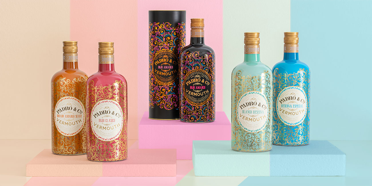
Our Padró & Co. vermouths are easily recognisable from afar thanks to their beautiful bottles in a range of striking colours, decorated with golden arabesque motifs. This appealing packaging catches the eye and beckons you over to try what is inside the bottles, a range of vermouths that will not leave you indifferent.
Following the positive reception we received with our Myrrha vermouths, from both consumers and critics alike, we decided to adventure out, with our knowledge and experience, on a journey into the world of high-end vermouths. This is how our initial family of four Padró & Co. came into being in the spring of 2016. We dressed our vermouths in this alluring and exceptional design to convey a message about the unique quality of the vermouth inside the bottles.
The labels, using a contrasting creative concept, introduce each vermouth and tell us something about the steadfast nature of the Padró family winery, where we have been making wines and vermouth since 1886. The oval shape of the label takes you right into the winery where our Padró & Co. vermouths rest in similar-shaped wooden barrels. The ivory colour of the label contrasts with the golden tones and arabesque motifs that represent the array of herbs, flowers, roots and spices infused in each vermouth. The complexity of flavours we are about to discover.
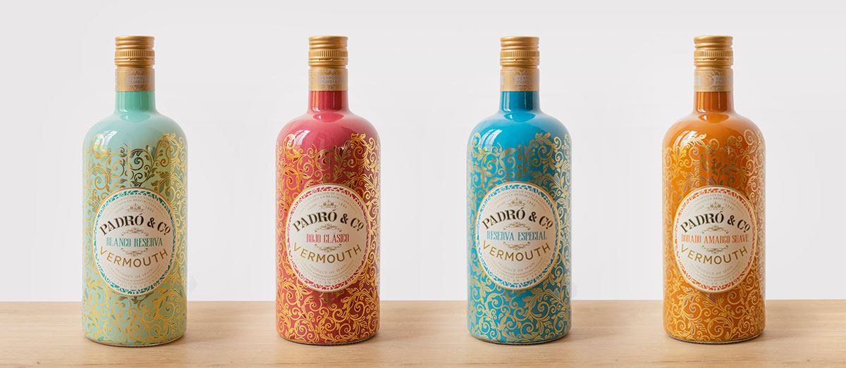
The colour of each bottle tells us something about its content: The lighter and pastel green colour of our Blanco Reserva evokes the refreshing sweetness of this white vermouth, in balance with the flavours of citrus, sweet herbs and aged mistela. The blue of our Reserva Especial is the blue of the Mediterranean Sea because what makes this vermouth special is a traditional wine from our area, a Tarragona Clásico. Rojo Clasico’s bold red intends to capture as far as possible the traditional essence of red vermouth while the warm colour of our Dorado Amargo Suave reflects the amber colour of the original vermouths.
We have thought carefully about each detail so that your sensory experience begins with your eyes and culminates in the satisfaction of having enjoyed a high-quality vermouth.
Our wooden gift crate also invites you to travel back in time.
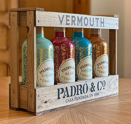
In the spring of 2016, we were about to launch our first four Padró & Co. vermouths. We wanted to find a presentation case for them that would be stylish but practical at the same time. Looking back in time, we became inspired by the crates that we had used at the winery in the 1960s, when bottles were returnable. It was the perfect link between the traditions of our solid wine- and vermouth-making history stretching back over more than 130 years and the innovation that Padró & Co. vermouth represents.
The exquisite 21st-century design of our coloured bottles of high-quality vermouth contrasts beautifully with this rustic wooden crate. You can reuse the crate for whatever you wish: to decorate your home, as a plant pot or whatever inspiration you may have. As for the bottles, they can be converted into lamp bases that are sure to add a delightful touch to a special corner in your home. We have no doubt that the most creative among you will know how to give these items a new lease of life.
Elegance and vivaciousness in our Rojo Amargo
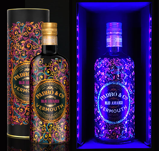
Our Padró & Co. Rojo Amargo was born a few months after the initial four. This is our most charismatic vermouth, the result of a double infusion of botanicals, and conceived mainly with cocktails in mind. This is why we opted for an even more ground-breaking bottle design.
Our purpose with the bold combination of fluorescent and metallic copper colours on a black background was specific: to take vermouth beyond the realms of la hora del vermut and out into the night. In the daytime, the metallic copper tones of our Rojo Amargo’s packaging shine out over colourful but sleeping fluorescent shapes. At night-time, under the UV-light of nightclubs, for example, the fluorescent colours light up, radiating energy and vitality. Our Padró & Co. Rojo Amargo vermouth bottle and its beautiful cylindrical case stand out clearly from other bottles on a shelf of drinks mixers.
Vermouths awarded for packaging
Among the many accolades our Padró & Co. vermouths have received, are several Spanish and international awards in recognition of our packaging:
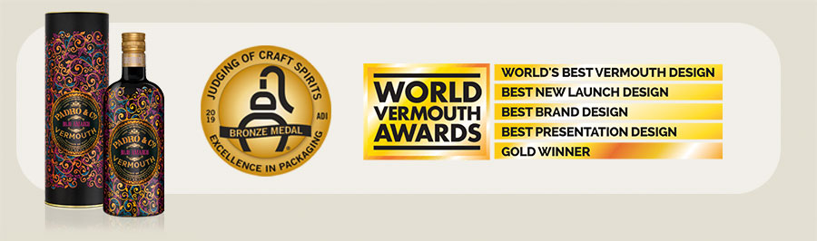
At the UK’s 2019 World Vermouth Awards, our Rojo Amargo received three awards in the Best Vermouth Design category: Best New Launch Design, Best Brand Design and Best Presentation Design. Also in 2019, our Rojo Amargo was awarded a bronze medal for Excellence in Packaging by the American Distilling Institute (ADI), in addition to three awards for quality.
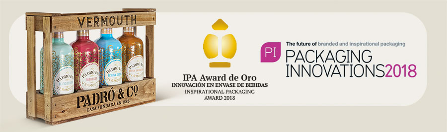
In 2018, the IPA Awards at the Packaging Innovations Fair held at IFEMA in Madrid gave our Padró & Co. four-bottle gift crate its Gold Inspirational Packaging Award for Innovation in beverage packaging.
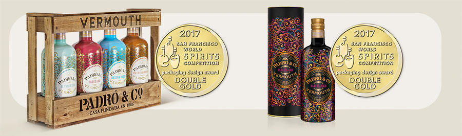
In 2017, the panel at the San Francisco World Spirits Competition (SFWSC) were dazzled by our Padró & Co. packaging, awarding us two Double Gold medals in the Packaging Design Category. One of these medals was for our Rojo Amargo in its beautiful tube and the second was for our four-bottle gift crate.
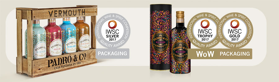
Also in 2017, our Padró & Co. won eight awards, two of them for packaging at the International Wine Spirit & Competition in London. On this occasion our wooden gift crate and the four vermouths it contains received a silver medal. Our Rojo Amargo in its luminescent bottle won a gold medal as well as the Novelty / WOW Packaging Trophy award, which commends packaging innovation.